Specsavers.
Joy of ordinary
sounds.
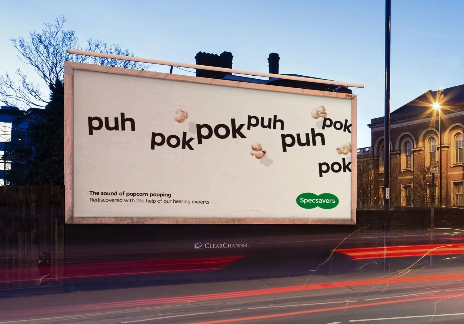
I was asked to create the typography and design for Specsavers Joy of ordinary sounds campaign.
The brief was to use pure typography for the Specsavers Joy of Sounds campaign. But, I thought adding a small amount of photography interacting with the words might help the idea and create interesting visuals.
Along with the typography, I created some of the campaign's photography and retouching. For example, the raindrops for the sprinkler execution were made using water hitting A1 paper from my garden sprinkler. The raindrops for the rain execution were created by dropping milk onto my hob and then shooting and retouching the ink bleeding to look like rain on ink.
I worked with Jon Morgan, Bertie Rapkin and Sid Tomkins on the campaign.
The campaign won at Creative Circle:
Gold - Best Press ad (campaign)
Gold - Best Print Poster (campaign)
Silver - Best Writing for Design (campaign)
Silver - Best Integrated Campaign (campaign)
Silver - Best Writing for Outdoor (campaign)
Silver - Best Writing for Press (campaign)
Bronze - Best Broadcast/Terrestrial TV 30secs or under (single)