

I was asked by Paul Sayer, Prost8 UK Founder and survivor of prostate cancer, to help kickstart the ONE IN EIGHT campaign with a new campaign logo and brand look and feel.
THIS YEAR UP TO 12,000 MEN WITH EARLY STAGE PROSTATE CANCER WILL RECEIVE THE SAME INVASIVE TREATMENT AS MEN WITH ADVANCED CANCER!
If you have a prostate cancer diagnosis you deserve to know about
all the new cutting edge treatment choices.
But these revolutionary treatments are rarely offered as a first choice, which is why THE ONE IN EIGHT campaign exists, to raise money for and awareness around these new cutting edge treatment choices, such as focal ablation, including ultrasound, cryotherapy and soon electroporation.
Visit prost8.co.uk to find out more about this charity that has new thinking at its heart.
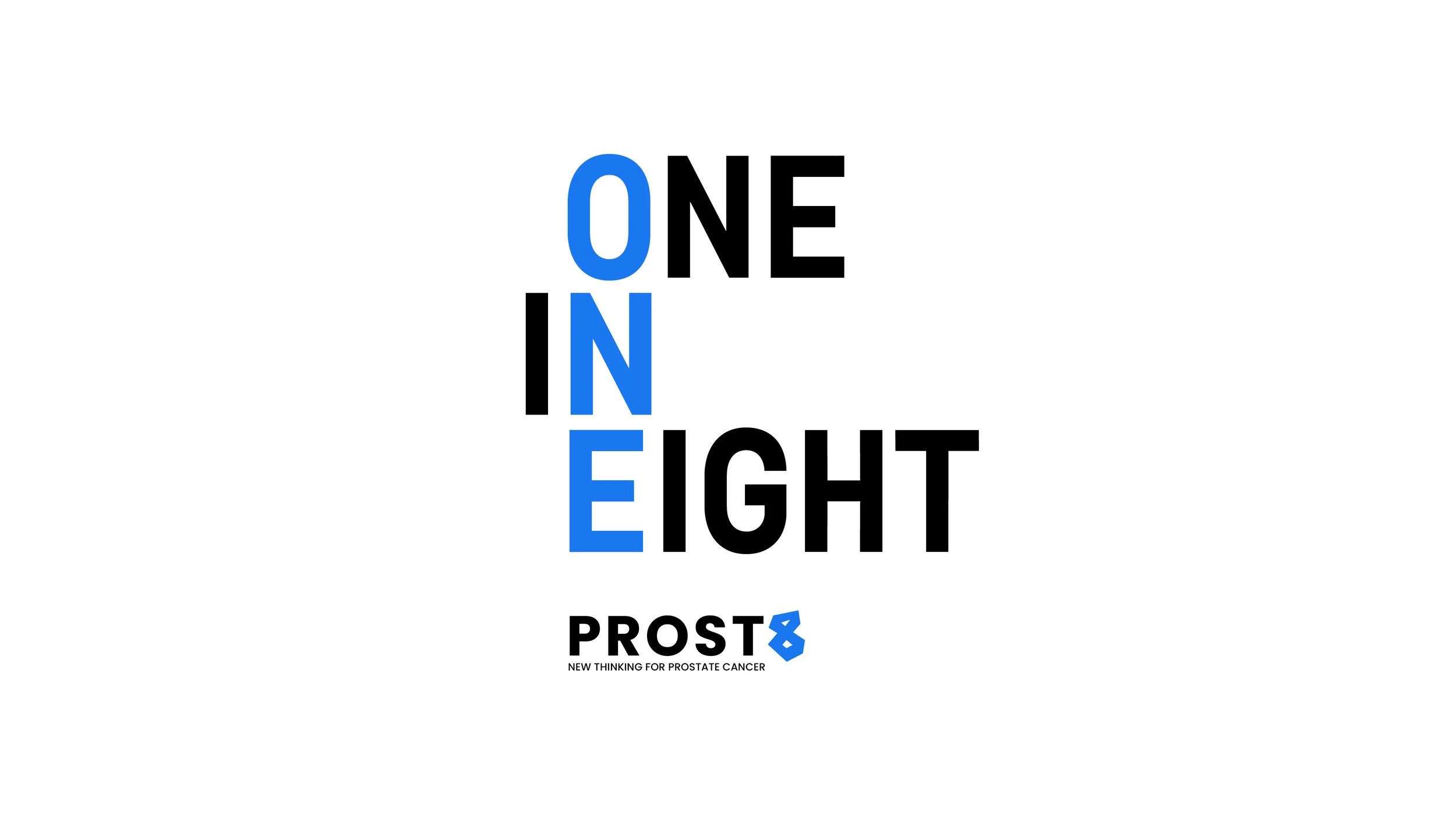
One in Eight Campaign

After initially working with the numbers 1 and 8, I tried spelling out the words, which made an interesting typographic composition. Highlighting the ONE is what the campaign is all about.
1, To highlight the stat one man in eight will develop prostate cancer in their lifetime,
and there are new cutting edge treatments that are available.
2, To raise funds to expand the capacity of these treatments for the NHS.
The logo

A small set of campaign guidelines for partner agencies
I believe guidelines need to be clear, with information to allow the brand flexibility to create and still retain a visual unity. So I created a graphic system that could be as big or small as a designer wants but is still rooted in the ‘one in eight’ brand.
Guidelines


-
![]()
Collection stand
I recommended Prost8 make this collection stand. Strongly branded and it allows people to donate directly to the campaign.
-
![]()
Press ad
I used some photography by Greg Williams in my presentation to Prost8. Not only is Greg a great photographer but he has supported Prostate cancer charities in the past.
-
![]()
Social
Using this long letter format on Instagram Stories to get the message out there.
-
![]()
Graphic 1in8 shape in use
A poster example using the 1 in 8 graphic shape.
-
![]()
Graphic system in use
A poster example using the one in eight graphic system.


