easyJet
Europe by easyJet.
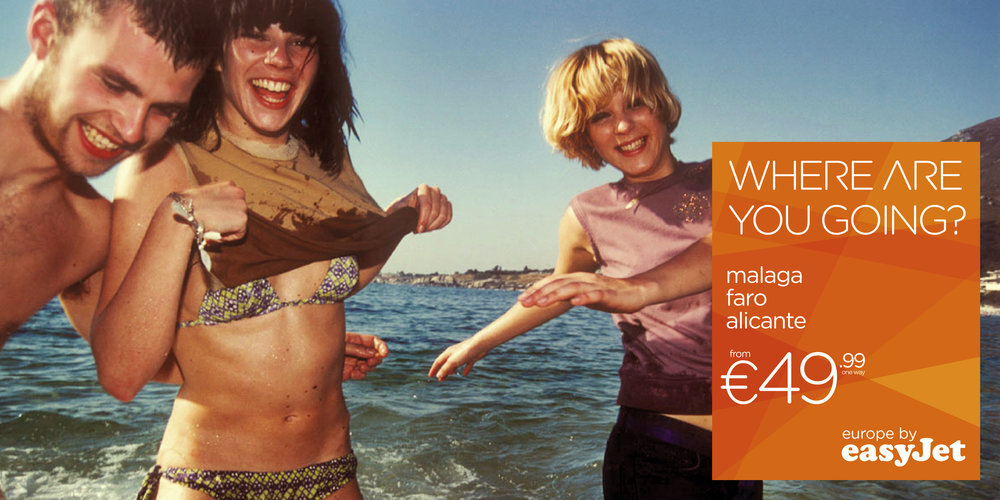
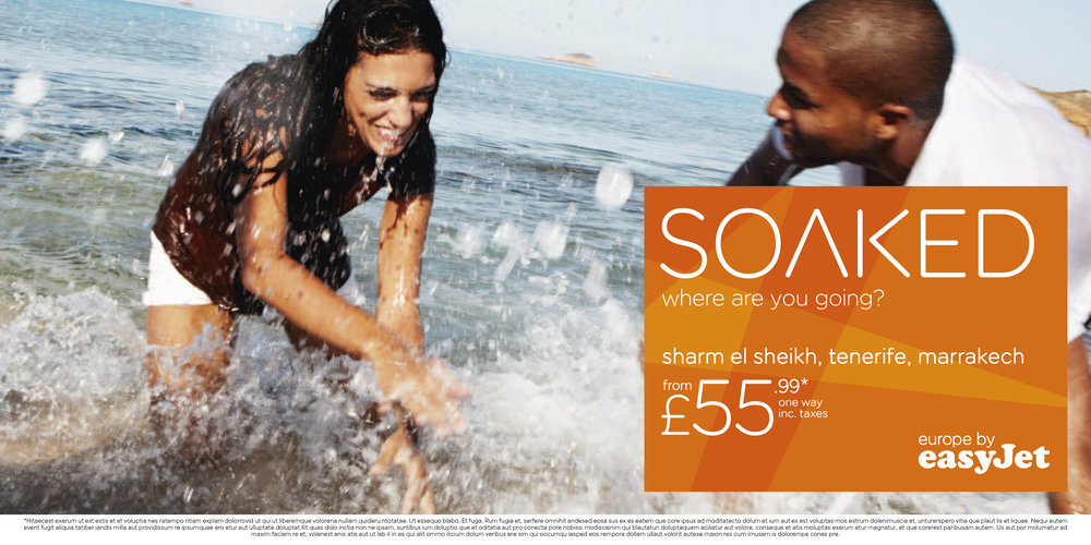
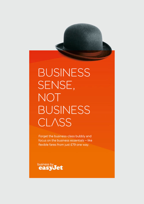
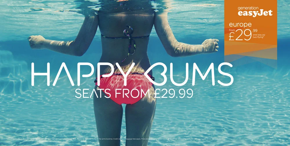
In 2011, VCCP won the pitch to update the easyJet advertising. The idea ‘Europe by easyJet’, was inspired by the vast number of easyJet routes across Europe, at the time there were 500. Through our styling of the campaign, more shades of orange, new fonts and the creation of the '500 graphic', a new brand identity was born.

The brand identity

The 500 graphic
easyJet has a vast number of routes across Europe, at the time there were 500.
This inspired the graphic above, each line representing one of the 500 routes across Europe.

Design system
For flexibility with layout, we crop into the graphic, allowing variants of background. Since 2011 the 500 graphic is used on ads, airports and comms throughout the brand.

New brand colours
The placement of the logo on the original easyJet orange is a requirement of the brand license. I suggested we add a darker and a lighter orange to the brand. These new colours were then added to the easyJet palette.