Pravha by Staropramen
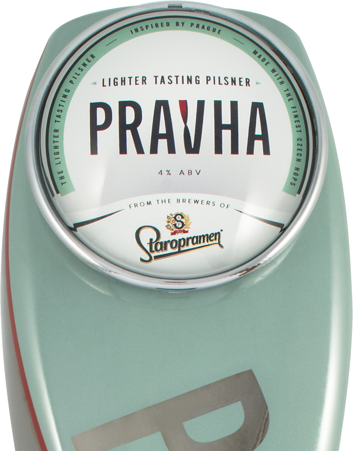
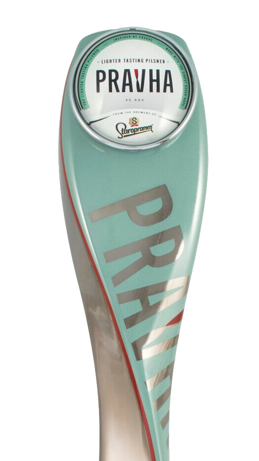
Whilst at VCCP I created the identity for a new Czech style beer brand. They had the name, Pravha. The brief was to create a modern twist on the classic pilsner that’s inspired by the unexpected side of Prague. I created the logo and in collaboration with Lee Bodell, we designed the bar runners, pump and pump badge.

The twist
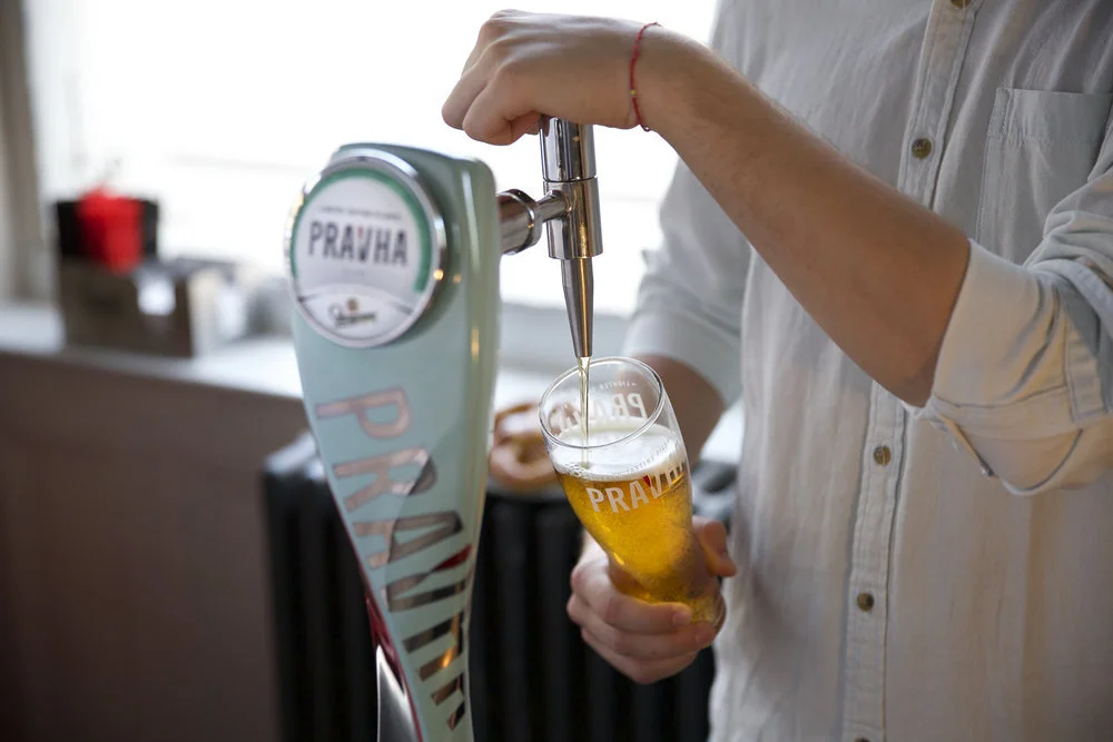
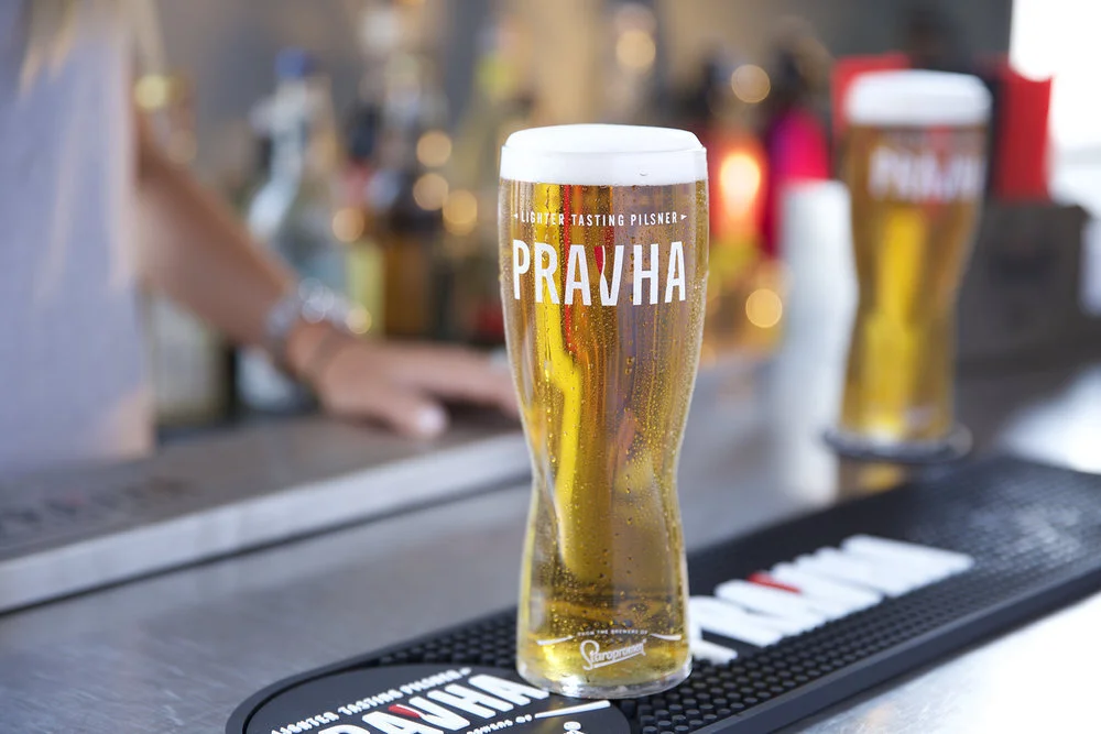
Working with the brief ‘A twist on a traditional Pilsner’. I chose a font that reflected the modern unexpected side of Prague and incorporated a twist to show this other side. The Pravha glass also has a twist and the pump tower follows the same brand principles. The pale green colour helped the brand stand out from the competition.
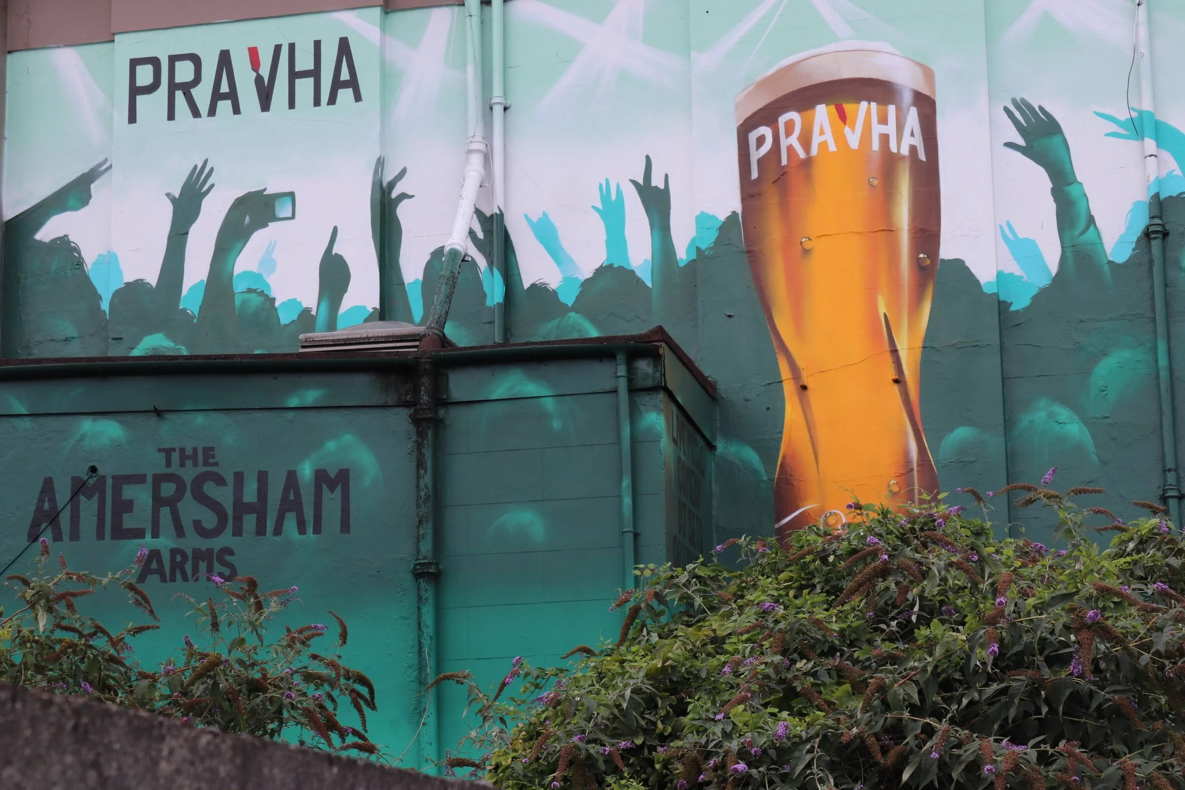
Not quite the right font ;) but a nice mural on The Amersham Arms pub in SE1
Pravha at The Hope and Anchor, Bristol
Pravha beer pump
Bar runner and glass
Guidelines
The lockup
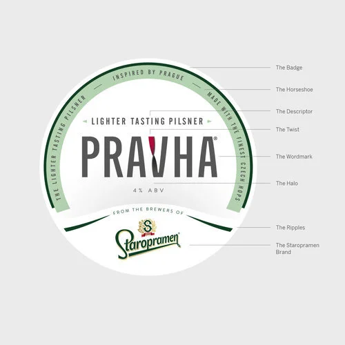
Brand guidelines were created for consistency across all touchpoints. It was important for the badge to work with the Staropramen identity.
Logo elements
There were a lot of elements to bring together in one unified lockup. Staropramen had its own set of guidelines to adhere to.
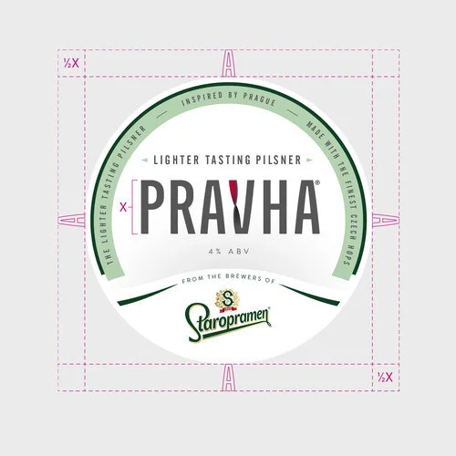
Clear space
Guidelines included clear space and also a minimum size version of the brand mark. The simplified version was created for the glass.


